Open source visual page framework GrapesJS development tutorial (4) - Creating Block
This article is an introduction to the visual page building tools GrapesJS development tutorial series of components, this series is mainly about GrapesJS and how to dock GrapesJS, how to integrate with CMS and other related content.
If you need to GrapesJS development has not been fully understood, you can refer to our previous related articles, this article mainly introduces how to create a Block inside GrapesJS.
Introduction to GrapesJS components
A component in GrapesJS is a component that contains information about how an element is rendered in the canvas (managed by the View) as well as its final code, and all Model properties are reflected in the View.GrapesJS supports the addition of a wide range of custom components, as well as built-in common basic components, such as blocks, text, images, and so on.
To develop components in GrapesJS, you first need to understand two core concepts: Component and Block.
Component defines what the label of a component is, what properties and methods it has, how it is displayed in Canvas, and what the result should be when saved as HTML.
A Block is understood to be a ‘code fragment’ consisting of one or more Components.
Generally speaking, what the user sees in the component library is the Block, after the user drags the Block to the Canvas, Grapes JS will convert them to Component through the parser, then if the user wants to edit the component's style, content, attributes and so on, it will become an interaction with the Component.
Block builds for GrapesJS
GrapesJS Block is mainly managed by BlockManager, after creating a Block, you can drag and drop it into the GrapesJS interface to use and edit it.
1. Creating Custom Blocks
The code file is component.ts, mainly ngOnInit triggered after the event, the specific code is as follows:
              createBlockTemplateConfirmation () {
               const selected = this.editor.getSelected();
               let name = this.blockTemplateForm.get('name')!.value
               let blockId = 'customBlockTemplate_' + name.split(' ').join('_')
               let name_blockId = {
                 'name': name,
                 'blockId': blockId
               }
               createBlockTemplate(this.editor, selected, name_blockId)
               this.blockTemplateForm.reset();
               this.modalService.getModal('createBlockTemplate').close();
             }
The createBlockTemplate method calls the relevant functions to get the component's css and js content, take a look at the source code of createBlockTemplate, (inside index.ts)
             export const getCss = (editor, id) => {
             const style = editor.CssComposer.getRule(`#${id}`);
             const hoverStyle = editor.CssComposer.getRule(`#${id}:hover`);
             if (style){
               if(hoverStyle){
                 return style.toCSS() + ' ' + hoverStyle.toCSS()
               }
               return style.toCSS()
             }
             else {
               return ''
             }
            }
              export const findComponentStyles = (editor:any,selected:any) => {
               let css =''
               if (selected){
                 const childModel =  selected.components().models
                 if (childModel) {
                   for (const model of childModel) {
                     css = css + findComponentStyles(editor,model)
                   }
                   return css+ getCss(editor, selected.getId());
                 }
                 else{
                   return getCss(editor, selected.getId());
                 }
               }
             }
              export const createBlockTemplate = (editor:any, selected:any, name_blockId:any) => {
               const bm = editor.BlockManager
               const blockId = name_blockId.blockId;
               const name = name_blockId.name;

               let elementHTML = selected.getEl().outerHTML;
               let first_partHtml = elementHTML.substring(0, elementHTML.indexOf(' '));
               let second_partHtml = elementHTML.substring(elementHTML.indexOf(' ') + 1);
               first_partHtml += ` custom_block_template=true block_id="${blockId}" `
               let finalHtml = first_partHtml + second_partHtml
               const blockCss = findComponentStyles(editor,selected)
               const css = ``
               const elementHtmlCss = finalHtml + css
               bm.add(`customBlockTemplate_${blockId}`,{
                 category: 'Custom Blocks',
                 attributes: {custom_block_template:true},
                 label: `${name}`,
                 media: '',
                 content: elementHtmlCss,
               })
             }
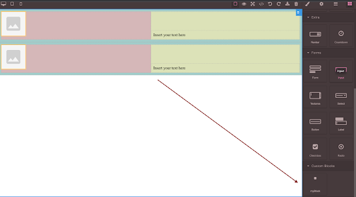
创建好Block之后,Block就会出现在GrapesJS的工具栏里面,然后通过拖拽就可以放到页面编辑区了,参考下图
2. Adding a Tools Menu to Block
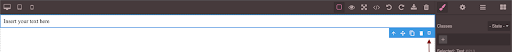
In each Block, when the mouse crosses up, there will be a toolbar, the user can click on this toolbar to do the response operation, of course, there are several default, such as copy, render, delete, etc. In addition, we can also customise the tool, such as configuration, the user clicks on it, then a configuration box pops up, in the configuration box, the user can do a variety of operations. The following code is to register a selected event to trigger the toolbar.
(Our dynamic components are developed in this way)
   this.editor.on('component:selected', (editor:any) => {
                 // whenever a component is selected in the editor
                 if (!this.editor) {
                   this.editor = editor
                 }
                 const selectedComponent = this.editor.getSelected();
                 if (selectedComponent && selectedComponent.attributes) {
                   //createBlockTemplate functionality
                   const commandBlockTemplateIcon = 'fad fa-square'
                   const commandBlockTemplate = () => {
                    // this.modalService.getModal('createBlockTemplate').open(); //Commented for          ………………… now as we have not made Modal yet
                   }
                    const defaultToolbar = selectedComponent.get('toolbar');
                   const commandExists = defaultToolbar.some((item:any) => item.command.name === 'commandBlockTemplate');
                    if (!commandExists) {
                     selectedComponent.set({
                       toolbar: [ ...defaultToolbar, {  attributes: {class: commandBlockTemplateIcon}, command: commandBlockTemplate }]
                     });
                   }
                 }
              });
The specific effects are as follows:
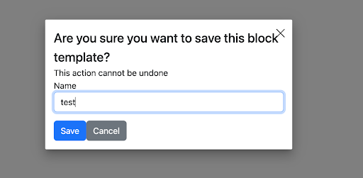
Then, we add a popup box to the toolbar click.
#1. Installing a modal box component
npm i ngx-smart-modal
            ng add @ng-bootstrap/ng-bootstrap
#2. Import the form inside the component file.
   import {NgxSmartModalService} from 'ngx-smart-modal';
               import {FormBuilder, Validators} from '@angular/forms';
Here is the source file for Component
 export class CustomBlockComponent implements OnInit {
             public editor:any = null
             blockTemplateForm = this.formBuilder.group({
               name: ['', Validators.required]
             })
Component's HTML file :
<ngx-smart-modal #createBlockTemplate (onAnyCloseEvent)="createBlockTemplate.close()" customClass="nsm-centered"
                                        identifier="createBlockTemplate">
                         <div class="modal-header">
                           <h4 class="modal-title"> Are you sure you want to save this block template? </h4>
                         </div>
                         <div class="modal-body">
                           <div>This action cannot be undone</div>
                         </div>
                         <form (ngSubmit)="createBlockTemplateConfirmation()" [formGroup]="blockTemplateForm" >
                           <!-- <app-form-errors [errors]="formErrors()"></app-form-errors> -->
                           <div class="col-sm-12 form-group mb-3">
                             <label for="name">Name</label>
                             <input id="name" type="text" class="form-control" formControlName="name"/>
                             <!-- <app-field-errors [errors]="fieldErrors('name')"></app-field-errors> -->
                           </div>
                           <div class="modal-footer">
                             <div class="col-sm-12 form-group page-form-controls">
                               <button type="submit" [disabled]="!blockTemplateForm.valid" class="btn btn-primary">Save</button>
                               <button (click)="createBlockTemplate.close()" class="btn btn-secondary" type="button">Cancel</button>
                             </div>
                           </div>
                         </form>
                        </ngx-smart-modal>
Component的CSS文件:
/* You can add global styles to this file, and also import other style files */
                        /* You can add global styles to this file, and also import other style files */
                        @import "~ngx-smart-modal/ngx-smart-modal.css";
                        .nsm-dialog.nsm-centered {
                         display: grid;
                        }
                        .nsm-dialog-lg {
                         max-width: 980px;
                        }
                        .nsm-dialog-xl {
                         max-width: 1200px;
                        }
                        .nsm-dialog-xxl {
                         max-width: 1500px;
                        }
                        .nsm-dialog-full {
                         max-width: 100%;
                        }
Finally, click on the toolbar to get the following effect.
Drupal与GrapesJS的集成演示请点击这里>>
For more on GrapesJS development and Drupal CMS, see our other related articles.